


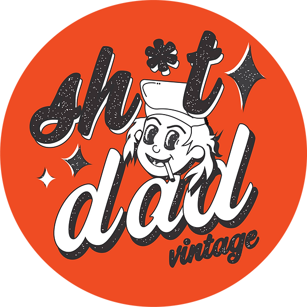
Sh*t Dad Vintage
this logo was done for a vintage reselling business. the name matches the aesthetic of the store, inspired by aging dads who have large collections of vintage clothing from their youth. the brand is an ecommerce business, based on instagram.
*concept
art house cinema
this logo was done for a small indie film studio called art house. the logo integrates retro with contemporary, using a 1950s style cartoon with a modern cinema style font.
*concept


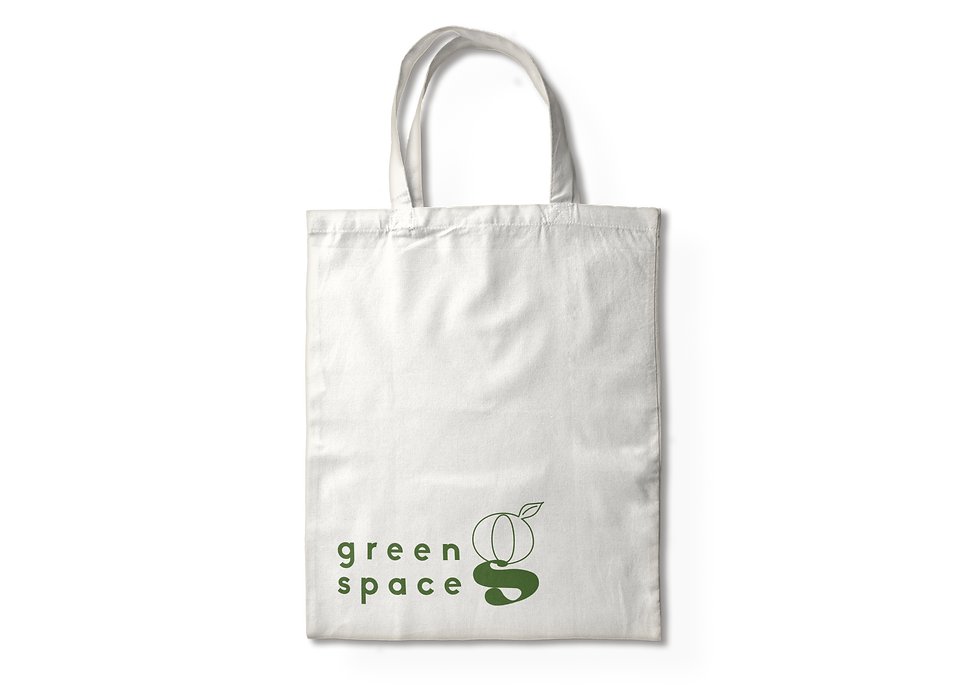

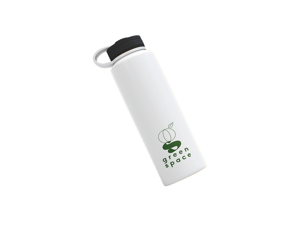
Green Space
this logo was done for a hypothetical company that sells green roofs to commercial businesses. THE LOGO IS CONTEMPORARY AND SYBMOLIZES PHYSICAL SPACE THROUGH THE HEAVY KERNING OF THE FONT.
*concept

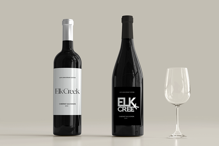
elk creek
These logos were done for 2 different target demographics, each with the same name. the first targeting middle income, millennial audiences shopping for a special occasion. the second targeting high income earners who want an artsy, fresh brand to try out for the night.
*concept

